Bootstrap is one of many CSS frameworks that uses the 12 column grid to create responsive layouts. If we design a website to fit a 12 column grid then we can use bootstrap to build responsive columns that collapse or expand depending on screen size using existing Bootstrap classes.
We use the Bootstrap framework for our web design projects.
Below is an example of Bootstrap columns that are in a row on small to large screens so that they are each 50% wide. On mobile screens they are 100% wide so they stack:
<code><div class="col-xs-12 col-sm-6">
First Content
</div>
<div class="col-xs-12 col-sm-6">
Second Content
</div></code>
Maybe we want to have three columns that are all 100% wide on mobile, with the first two 50% wide on small screens and all of them 33.3333% wide on medium to large screens.
To do this, we can just add/edit classes to our 12-col grid Bootstrap based web site:
<code><div class="col-xs-12 col-sm-6 col-md-4">
First Content
</div>
<div class="col-xs-12 col-sm-6 col-md-4">
Second Content
</div>
<div class="col-xs-12 col-md-4">
Third Content
</div></code>
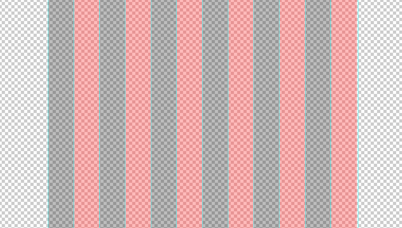
So, we know how the responsive columns will work. But it's going to be very tricky unless the site fits into this grid, so we need to make ourselves a 12 column grid template which can be done by measuring the site width at 1170px wide and adding 12 equally spaced guides and/or shaded areas that we can lay over our website to keep things within the grid:

If you want to use the 12 column grid but introduce space between things, you can add inner div tags with padding like this:
HTML:
<code><div class="col-md-8">
  <div class="inner">
 <p>Lorem ipsum dolor sit amet, consectetur adipiscing elit. Vestibulum pellentesque dui non rutrum mollis. Nunc ut nulla vel velit pellentesque pharetra at sit amet risus. Etiam bibendum, orci in porttitor efficitur, eros sapien elementum magna, non placerat mi odio non dui.</p>
  </div>
</div>
<div class="col-md-4">
<p>Quisque maximus ultricies enim, ac pulvinar lectus ornare nec. Nam efficitur purus at tortor viverra, ut ultricies arcu mattis.</p>
</div></code>
CSS:
<code>.inner {padding-right: 5%}</code>
Join the discussion
Want to have your say on this topic? Start by posting your comment below...
Can we help?
We are a digital agency, specialising in web design, development, hosting and digital marketing. If you need help with anything, feel free to reach out...
Related Articles
Web design jobs in London
19 May 2025
Keep up to date


