What's in this article?

What makes a great charity website [+ examples]
 By David Reeder | 14 April 2020
Creating a great website is tough. To get it right, you need to consider everything from branding to visuals, style and tone, as well as a boatload of technical stuff in between.
Introduction
At the start of the process, you’ll find yourself asking:
- What colour scheme matches my organisation’s values?
- Should I use images or illustrations?
- What visual style is appropriate for my audience?
- What content management system (CMS) should I use?
- What web hosting is best for my business?
- Should I use a theme or have the site custom coded?
And that’s not even the half of it. There are many questions and few definitive answers. It’s enough to give Sherlock a headache.

But, for charities, budget, resource and policy constraints add an extra spicy layer of complexity. And, since research shows that only 50% of charities have a digital strategy, it’s likely you’re putting a website together without the hefty marketing teams that many for-profit businesses rely on.
But don’t worry! We know it’s not easy. So we’re here to help you nail down the basics of charity web design so you can build the right presence online and reach the future supporters you need.
6 things great charity websites have
Your charity’s website is the centre of its marketing efforts and the main asset that your other marketing and advertising will lead to. So, it needs to be pretty good.
But what makes a great charity website? Here’s our list of 6 things that all great charity websites have. Use this info to plan, build or just inspire your new website’s design.
1. Multimedia
Research clearly shows that people prefer multimedia websites. But what do we mean by ‘multimedia’ and how can you include it in your strategy?
The term ‘multimedia’ refers to any content that uses different types of media side-by-side. We’re talking images, video, graphics, animation, text and more.
People respond to information in different ways and how well they understand a message depends a lot on the type of media used to get it across. Some people like reading, others prefer video, and some just ‘get’ graphs and charts. To appeal to a broad audience, your website needs to present the same message in a range of ways using different media types.
This example from Life in my shoes’ shows how you can tick all of those boxes in the above-the-fold (visible before you scroll) area of your Home page.
By communicating their message in text, video, graphics and images, they’ve appealed to the widest possible audience right off the bat.
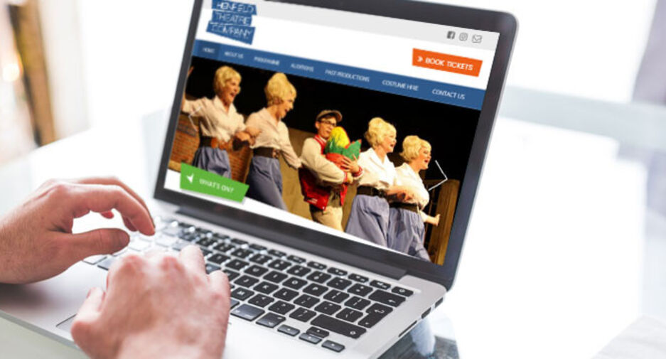
2. Simple navigation
People tend to visit a website with a goal in mind and they want to acheive it as quickly and easily as possible. One way you can help your website visitors do that is by keeping your website navigation simple.
In this example from Special Effect’s, the navigation bar is clearly visible above-the-fold, so it’s instantly available to anyone landing on their Home page. This ensures that the website quickly segments visitors into targetted pages based on what they’re looking to achieve, e.g. potential volunteers get funneled to the ‘GET INVOLVED’ page, potential donors to the ‘DONATE’ page.

And before you start thinking up cute and creative titles for your navigation categories, remember that people are unlikely to appreciate them. Being clever can actually be confusing.
3. A clear call to action (CTA)
As a charity or non-profit, you might want to place a strong call to action (CTA) in the above-the-fold space of your Home page. If your message is very simple and the action you want your website visitors to take is well defined, having a simple CTA can significantly boost site conversions.
So, whether you want people to donate, subscribe, or something else, that message should be clear and visible from the moment a visitors lands on your page, as in this example from Invisible Children. The page’s ‘DONATE’ CTA is front and centre and there is little in the way of distractions. Even the navigation menu is hidden.
")
4. A clear message
It’s important for all businesses to be clear in their messaging. But it’s especially so for charities. Great websites aren’t cheap and they take effort to maintain. So, you want to create an asset that works hard for your cause. And you do that by inspiring visitors to take action.
Anti-slavery International has done a great job with their Home page messaging. The site moves visitors through a defined narrative with minimal distractions and the vocabulary and CTAs are consistent.

When you define a clear message right from the start, your website will take people on a journey and actually do the job that it was made for.
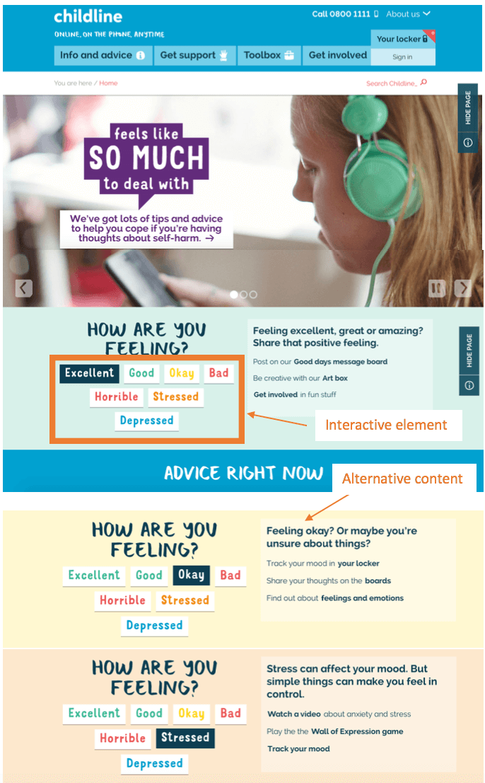
5. Interactive elements
Let’s face it, it’s always been easier to sell a product than an idea. So charities need to find innovative ways to catch and hold people’s attention. One of the best ways to do this is to include interactive elements on your website.
Think about it! Would you rather scroll through a Home page reading paragraph after paragraph of information, or take a fun but informative quiz that gets the same message across?
Childline does a great job of communicating their message through an interactive “How are you feeling?” feature. Visitors select an emotion that represents their current mood and the message and colour scheme change to match. The best part? The content offers crucial advice and gets visitors thinking about the issue they’re trying to address.
6. Humanising features
When you’re promoting a cause, you need to reach out and make a connection. And, in the digital world, that means keeping it human.
When you can’t meet your audience face to face, try showcasing your supporters, writing conversational content and using relatable, people-led imagery.
Campaign organisation HeForShe does this by focusing their visitor’s attention on a video of their global supporters. The video highlights their subject-matter and creates powerful social proof that will drive visitors to take action on their site.

This approach continues down the page where they highlight the number of people who have already taken action for the cause.

5 examples of showstopping charity website design
To give you that extra nudge to get your project started, we’ve scoured the internet to find 5 of the more impressive examples of charity website design. All of the organisations in this list are here because they excel at everything we’ve discussed above.
Room to read
View the site here.

What we love
- Clear messaging
- Consistent narrative that uses animation to lead viewers through the story
- Simple navigation that segments the website’s different audiences right off the bat
- Plenty of humanising images, quotes and conversational language
What we’d change
Some design elements make the page feel busy. When there are too many images or a lack of white space can be overwhelming and detracts from the website’s message.
Charity Box
View the site here
What we love
- The tone is very friendly and conversational, which is humanising
- The one-page design offers a strong narrative and CTA
- The most important points are highlighted with animations, icons and charts
What we’d change
The site has most media covered, but it’s missing a video. Adding a video to the site would tick all the boxes for multimedia appeal. The design of the CTA buttons could also be better. By being a little bolder with the button design, they’d increase conversions.
Bill & Melinda Gates Foundation
View the site here
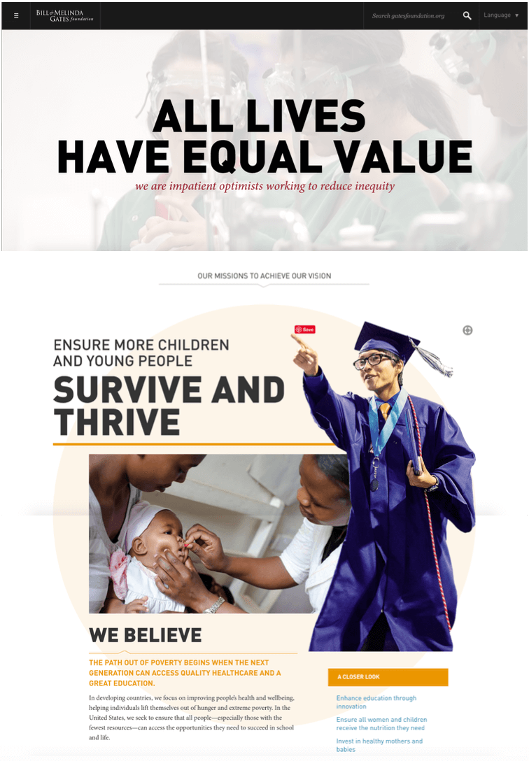
What we love
- The use of multimedia, including graphics, videos, images, text etc. is really engaging
- The Home page showcases the people behind the projects
- They’ve got just the right balance between features and white space
- The navigation is hidden, which draws all of the attention to their key message above-the-fold
What we’d change
The Bill & Melinda Gates Foundation has a truly gargantuan budget. So, it’s unsurprising that there’s little about their website that can be improved. But, if I had to be picky, I’d say the Home page could benefit from fewer CTAs. There are CTAs throughout the entire page, plus 5 at the bottom. Having too many options confuses visitors.
Upstream Mint
View the site here
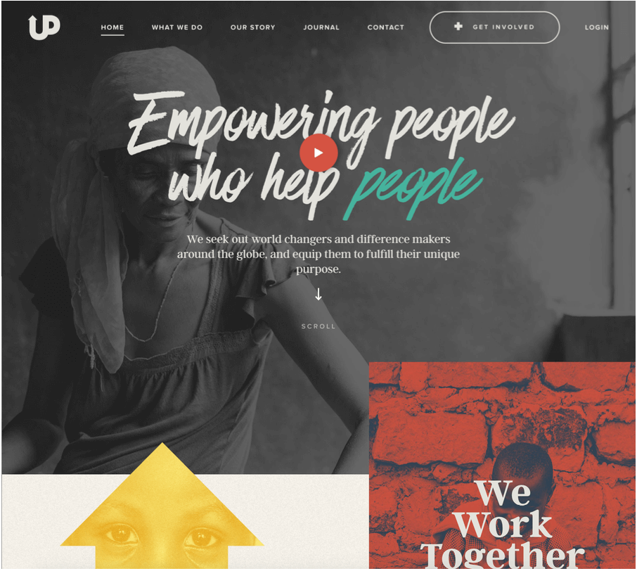
What we love
- Creative use of typography adds interest
- Their multimedia game is strong
- The visuals are stunning, with a really well-defined and memorable colour palette
- The subtle use of animation makes it feel ‘cutting edge’
- Their message is incredibly well-defined and the narrative is sustained throughout
What we’d change
I’m hard pushed to find anything about this website that could be improved. But, if I had to change one thing it would be to hide the navigation above-the-fold so that when people land on the Home page they’re more likely to click the video play button and take in that powerful opening message.
That’s Not Cool
View the site

What we love
- The website is perfectly tailored to its target audience: young people who spend a lot of time online and use different devices to access information
- The slider is unique enough to hold attention without being too distracting
- The hidden navigation means visitors are much more likely to play the video featured above-the-fold on the Home page
- There are more visuals than text, which is perfect for their target audience
What could be improved
This is another one of those sites where there’s not a lot of room for improvement. But, if I was to be picky, I’d suggest hiding the social buttons on the first slider because I find them distracting when I’ve just landed on the page. But, maybe I’m just getting old.
To sum things up…
Creating a great charity website is a daunting task. But there is a formula that you can follow. By offering multimedia, simple navigation and interactive elements and keeping your messaging and CTAs clear and human, you can create a website for your charity that rivals any in this post.
Join the discussion
Want to have your say on this topic? Start by posting your comment below...
Can we help?
We are a digital agency, specialising in web design, development, hosting and digital marketing. If you need help with anything, feel free to reach out...
Related Articles
What do you need on a good charity website?
21 November 2023

Maximising charity revenue: The power of monthly donations
22 September 2023
What are the legal requirements for charity websites in the UK?
11 September 2023
Keep up to date