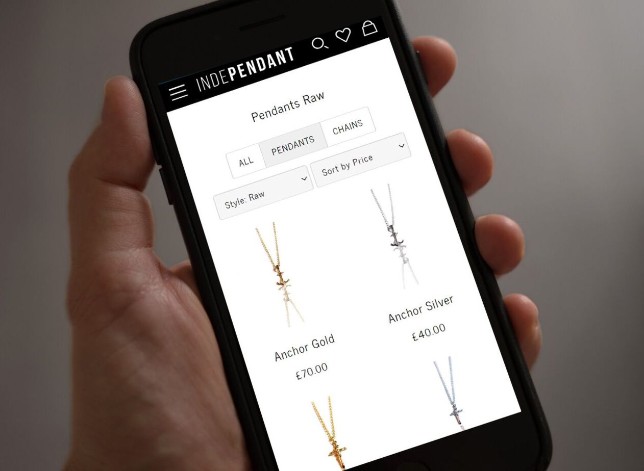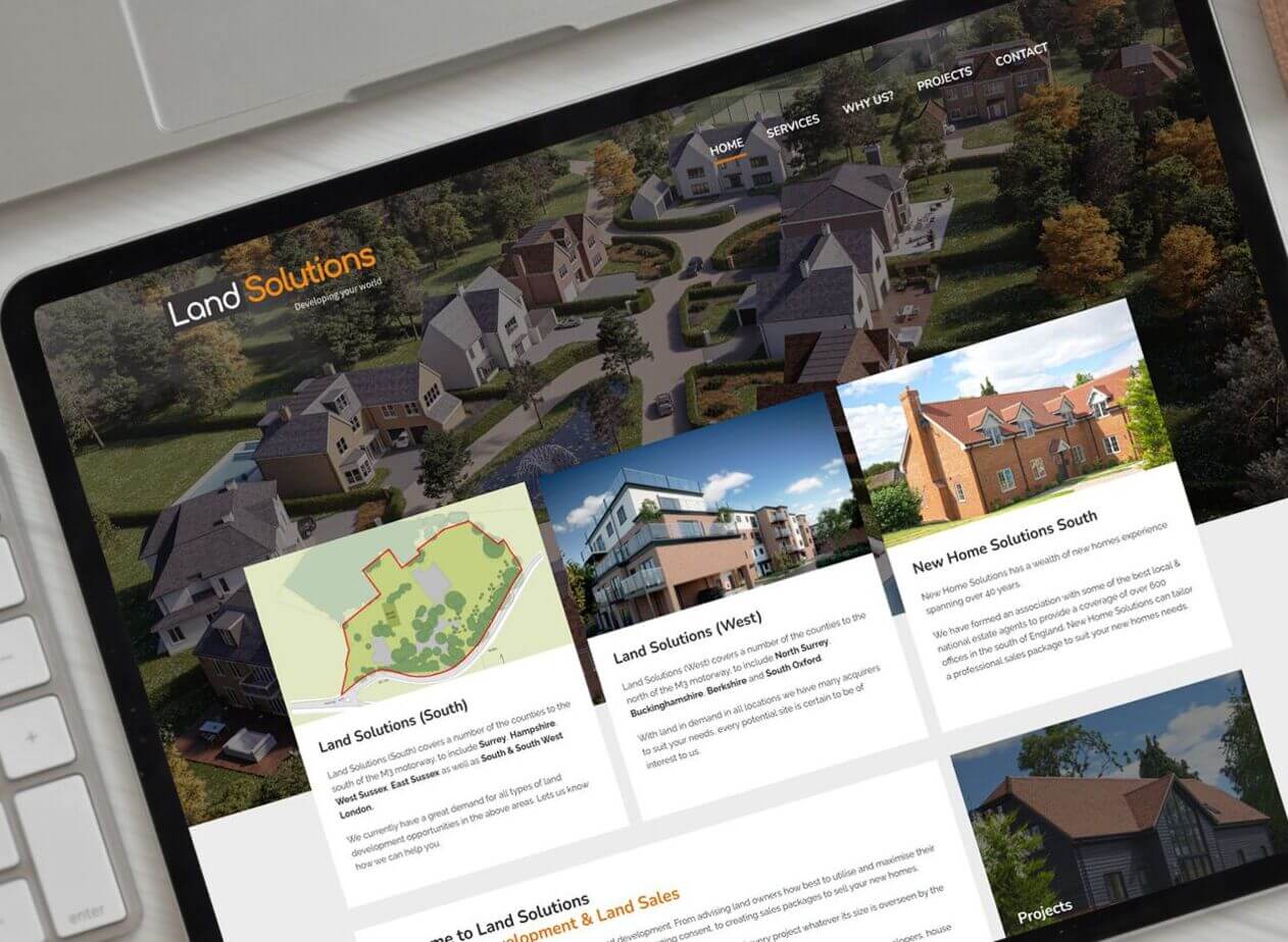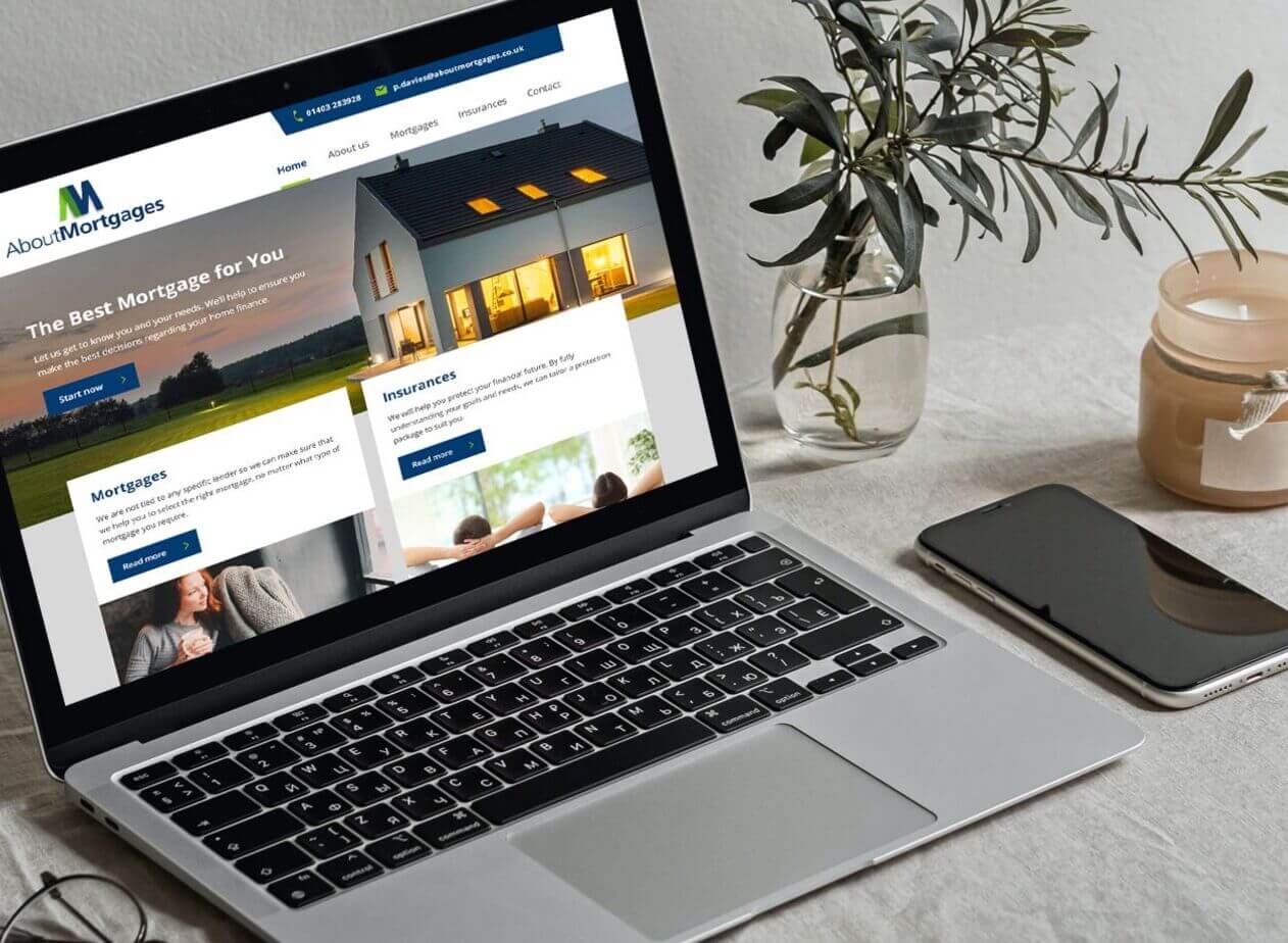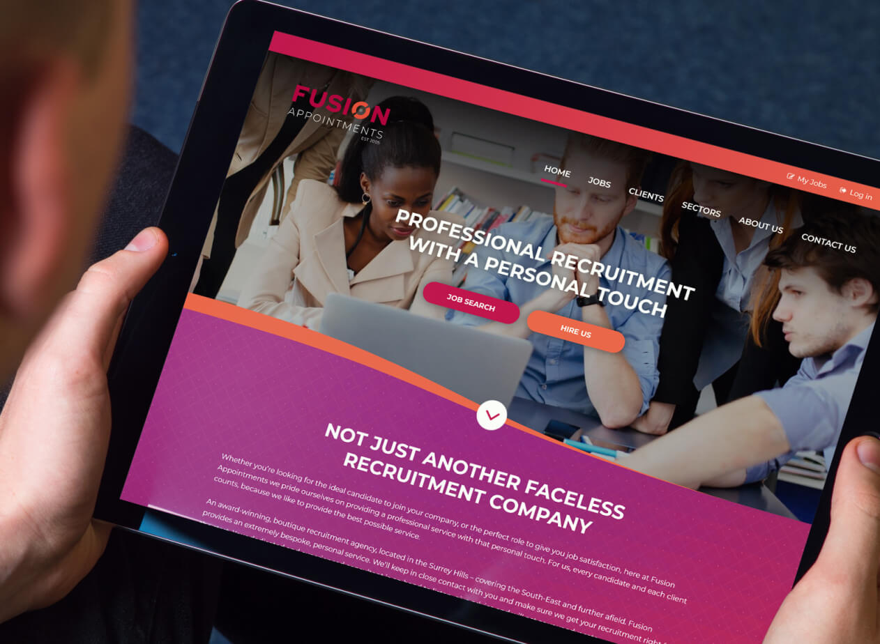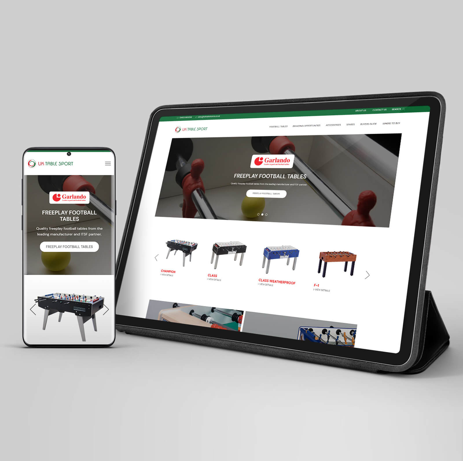
Why do you need a responsive web design agency?
Responsive web design is essential in the new era of mobile users and is a key part of our web design service.
Users are accessing your website with a variety of devices, which are hugely different in terms of screen size, shape, performance and how they react to the code your site is built in.
With 15+ years experience of building responsive websites, we understand what needs to be done to create an experience that works well for all users, so you don't lose precious sales.
Responsive web design is essential
Responsive web design is essential in the new era of mobile users and is a key part of our web design service. We can help build you a website that corresponds with the online modern market demands, leaving you with a site that has numerous benefits including:
Responsive to your screen size
Web pages are designed to adapt to different screen sizes such as mobile, desktop and tablet.
Simple to design & amend
New design and development changes automatically resize to the required device. One design is all you need.
Better UX & site performance
Mobile search users are overtaking desktop, so Google prioritises websites tailored for this purpose.
The explosion of mobile
Some websites are accessed more by mobile phone users than people on desktop computers, and that trend is likely to become even more biased towards mobile. Afterall, users can use their phones anywhere, not just at their desk. None of us can afford to ignore mobile internet users, so responsive design is the most popular solution to looking after those users and giving them an accessible, frustration-free experience when using your website.
Not catering for mobile users has some serious implications. Those users will become frustrated not being able to easily read test and navigate through pages. This results in them leaving your site quickly (bouncing) and ultimately you will lose sales of your products/services... something which we must avoid!
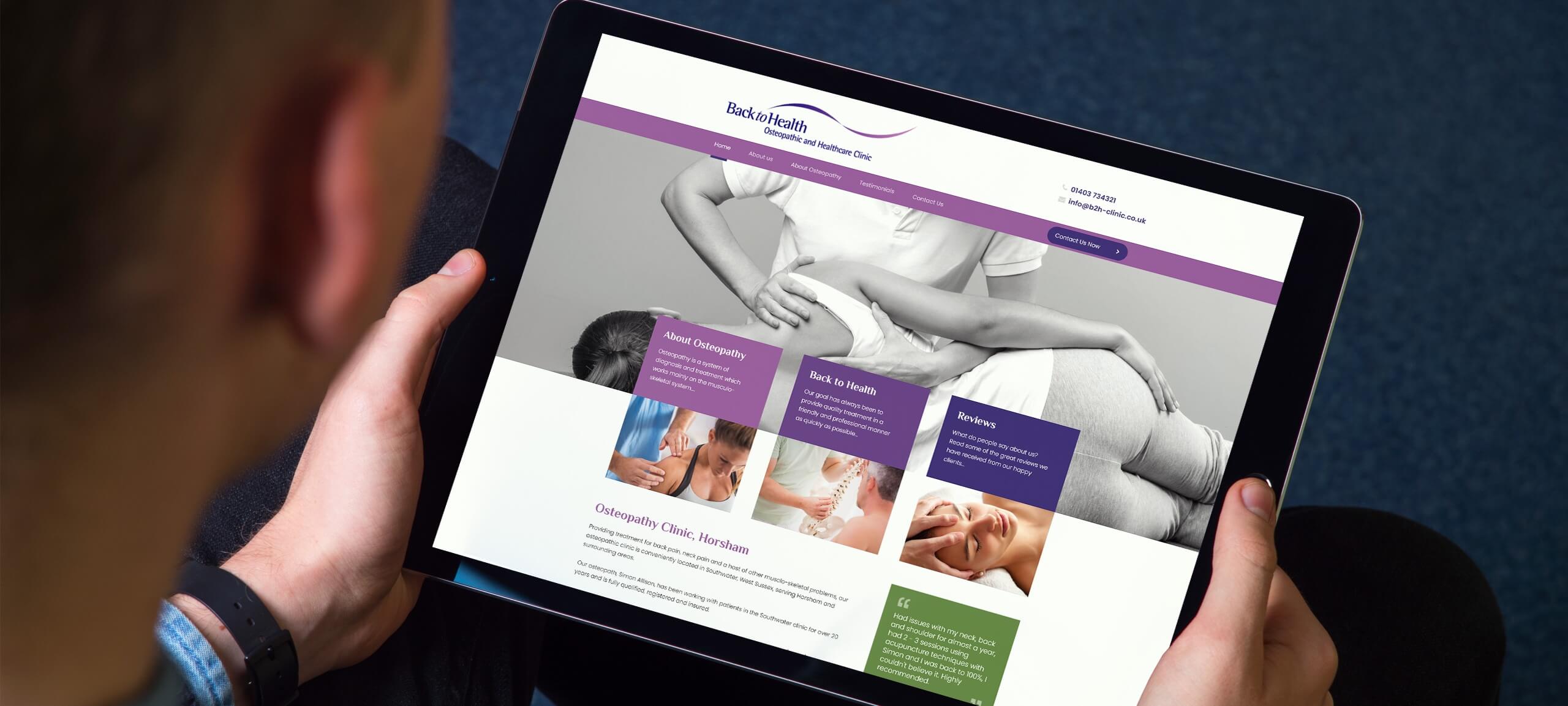
Our "Responsive" Process
At Made Simple Media, our responsive web design agency team has streamlined the process over time of how we deliver our high-quality website design fit for all devices, which is always a massive success for you, our treasured client. We do this by:

Planning and designing for every user, no matter what their screen size.

Building your website using the industry-leading responsive CSS framework, Bootstrap.
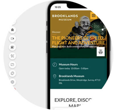
Testing on a variety of different devices to see how the site renders and interacts with touch, keyboard, and mouse.

Ensuring that when you add new pages or content, the site is still fully responsive.
Find out more about our full web design process.
Below is more detail on each main stage so you know what you can expect from our responsive web design agency:
1. How we design a responsive website for your business
The designs we come up with in conjunction with your input are compliant with both mobile and desktop devices:
Mobile:
- Navigation is usually like a list, because it can then run down the tall-narrow screen.
- Touch device, so the navigation needs to respond to the user touching on the links and they need to be spaced out enough that the user won't trigger two links at once.
Desktop:
- There is a much wider screen so we usually have all the navigation elements in a line.
- Graphics are used for multiple purposes, including marketing, promoting and navigating with multiple types available for the latter.
We use design software like Adobe XD or Figma which is much better at not only desktop website design but also for mobile. In these applications we can add both desktop and mobile art boards to show you the design of your site at various screen sizes.
2. Bringing the design to life through the build
As with the design, we build the site using a 12 column grid. We use the popular Bootstrap framework to build reliable, flexible responsive layouts.
To tell the browser that it's a responsive website and to scale it to the viewport, we add a viewport meta tag like this:
<meta name="viewport" content="width=device-width, initial-scale=1, minimum-scale=1" />
This also allows users to pinch-zoom on mobile so they can check out the detail in images.
We also add media queries to change things at certain sizes, such as the size of the logo or text:
@media screen and (min-width: 1200px) {
  p {
    font-size: 18px
  }
}
Our responsive web design agency uses ConcreteCMS which provides you with the ability to toggle whether an element (such as a picture, text box or video) is visible on certain devices:

The build for your website will also include:
- Small file sizes: Mobile devices don't have so much processing power and are often on limited bandwidth, so we take that into consideration when creating responsive websites.
- Compliant styling: Once mobile is looking great, we move onto tablets and work our way up to desktop screens.
- Emulation: We use Chrome of Firefox's console to closely mimick how the design performs on each device and to fix any teething issues. Although, full emulation is carried out in the later testing stage.
3. Responsive images and video
Your content needs to adapt to various sizes, so we add it once it works on all devices. We ensure that images and video will resize, but not go larger than the website that contains them.
The HTML picture element helps us specify images to show at certain screen sizes:
<picture>
  <source media="(min-width: 650px)" srcset="img_food.jpg">
  <source media="(min-width: 465px)" srcset="img_car.jpg">
  <img src="img_girl.jpg">
</picture>
This gives us more control to show smaller images on mobile devices.
4. Testing
Now to make sure everything is working to perfection on all device formats!
We use our PCs, laptops, tablets and phones to test the behaviour of the responsive website on those devices.We then use an emulator called Lambdatest to test it on a greater range of devices like Android, as well as, iPhone.
Our responsive web design agency team is one step ahead... With the future in mind, we ensure that when clients update their website via the CMS, that all existing and new content features work smoothly!
We also recommend that clients take out a website warranty which enables us to do a monthly check to make sure everything is still looking good and any new content on the website is nicely responsive.
A responsive web design agency with proven success
We have outlined and explained how some of our responsive website design process works, and how it would be applicable to your online business.
But don't just take our word for it, read to see what some of our clients have had to say after investing in our responsive web design process.
What's next?
Contact us for a friendly, no-obligation chat about your project...


Discover more...
Here are some other pages you may be interested in reading:
95+
Happy clients150+
Websites in our care9+
Years trading94%
Client retentionHow can we help?


